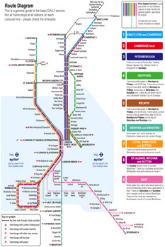
All men may be created equal but First Capital Connect understood that not all network diagrams are.
The success of Henry Beck’s London Underground ‘map’ from 1933 has sadly caused many people to think that these diagrams are easy to design. After all, they are only a load of straight lines. Wrong.
New designs by FWT
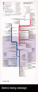
Dissatisfied with their long-standing network map, First Capital Connect approached FWT to ask if we could do something better. The existing design appeared to obey all the supposed rules but somehow looked clumsy and the station names were hard to read.
The problem was the lack of balance between the thickness of the lines and the size of the station names. This was compounded by an inappropriate typeface being used, that was too heavy and too wide. This meant that the size of the station names was too small. The importance of using appropriate typefaces for different purposes is commonly not understood, not just for maps and diagrams. Bold type at small sizes is a bad combination for legibility.
 We re-designed the geometry from first principles, ensuring a better visual flow of the names along the lines. We also changed the typeface to something with more relevant stroke widths and character shapes, that suited use at small sizes.
Specifically designed to fit their pocket timetables, the new diagram appears in the new First Capital Connect timetable book for 18th May 2014.